Google's Mobile-Friendly Test Is Gone: What to Use Instead in 2026
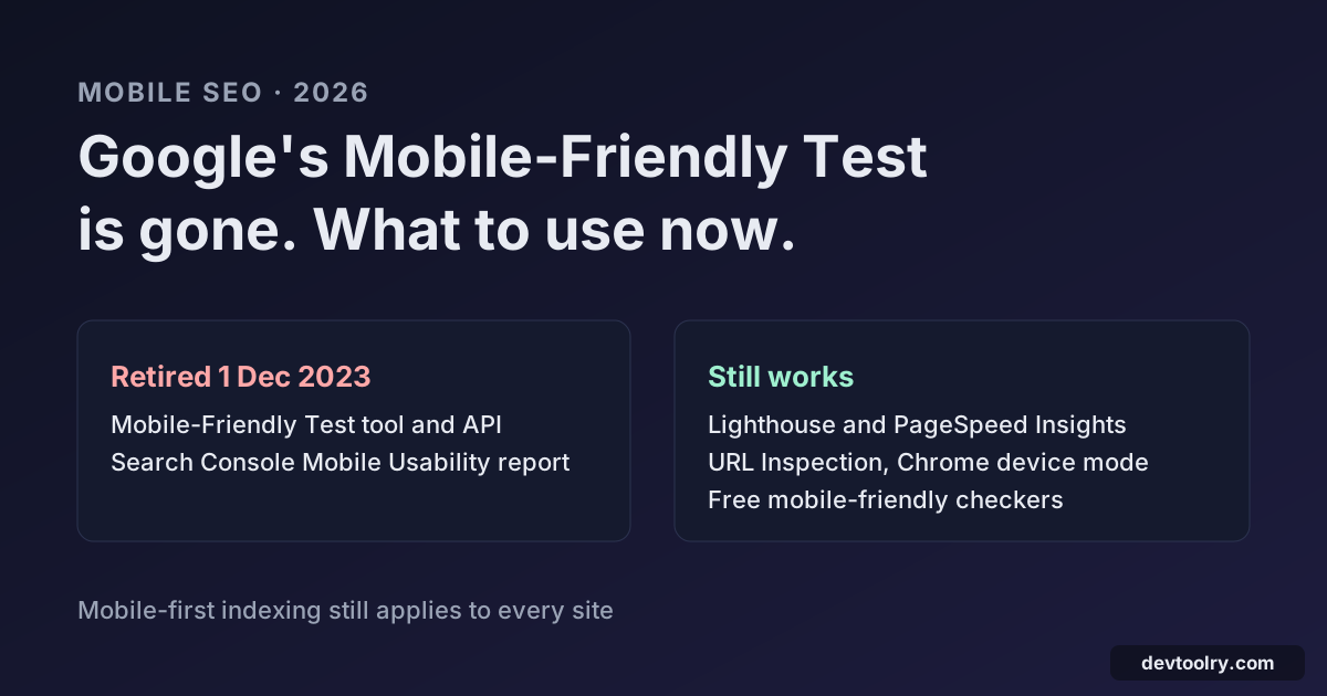
Google retired its Mobile-Friendly Test and the Mobile Usability report in December 2023. Here is what still works for checking a page on phones, and how.
 By Avinash KoriPublished 4 min read
On this page
For years the first stop for "is my site mobile friendly?" was a Google tool: paste a URL, wait a few seconds, get a green "Page is mobile-friendly" or a list of problems. That tool no longer exists. If you have searched for it recently and landed on a dead link or a help page, here is what happened, why it still matters, and what to use instead.
Is Google's Mobile-Friendly Test still available?
No. Google retired the Mobile-Friendly Test, the Mobile-Friendly Test API and the Mobile Usability report in Search Console on 1 December 2023, after announcing it in advance on the Search Central blog. Google pointed site owners to Lighthouse, which runs deeper mobile checks, as the replacement.
What did not go away is the reason the tool existed. Google moved every site to mobile-first indexing: it crawls and indexes pages with its smartphone crawler, and since July 2024 even the last desktop-only sites are crawled that way. Whatever your page shows on a phone is what Google indexes. Text or links missing from the mobile version are missing from Google.
So you still need to check your pages on mobile. You just need other tools.
What the old test checked
The Mobile-Friendly Test looked for a short list of problems, and the same list is still a good checklist:
| Old error message | What it means | Usual fix |
|---|---|---|
| Viewport not set | No viewport meta tag, so phones render a 980px desktop page and shrink it | Add the viewport tag to the head |
| Viewport not set to device-width | The viewport has a fixed width | Use width=device-width |
| Content wider than screen | Something forces sideways scrolling | Replace fixed widths with max-width: 100% |
| Text too small to read | Font sizes below about 12px | Use 16px body text |
| Clickable elements too close together | Links and buttons are hard to tap | Give tap targets about 48px of space |
| Uses incompatible plugins | Flash or other plugins | Use HTML5 video and JavaScript |
The single most common failure was the first one. The fix is one line in your page template:
<meta name="viewport" content="width=device-width, initial-scale=1">Do not add user-scalable=no or maximum-scale=1. They stop people from zooming in to read, which is an accessibility failure, and Lighthouse flags them.
Alternative 1: a mobile-friendly checker
The closest replacement for the old one-click test is a dedicated checker. Our free Mobile-Friendly Test makes the same checks without a Google account: it loads the page as Googlebot smartphone, reads the viewport tag and up to six of the page's stylesheets, and reports content wider than the screen, small text, disabled zoom, plugins and CSS or JavaScript that robots.txt hides from Google. You get the same kind of verdict ("Page is mobile-friendly" or the failures that stop it) plus a score for each area.
It reads the HTML and CSS the server sends and does not run JavaScript, so it is fast and shows what Google receives first. For pages built entirely in the browser, pair it with a rendering test from the next section.
Alternative 2: Lighthouse and PageSpeed Insights
Lighthouse is the tool Google pointed to when it retired the test. It renders the page in an emulated phone and audits it, including the viewport, font sizes, tap targets and Core Web Vitals.
- In Chrome, open DevTools (F12), choose the Lighthouse tab, select Mobile and run the audit. The SEO and Accessibility sections hold most of the old mobile-friendly checks.
- PageSpeed Insights runs the same Lighthouse audit from Google's servers and adds real-user data from the Chrome UX Report when the page has enough traffic. Our Page Speed Checker shows the same mobile scores and field data in one view.
Lighthouse is thorough but slower, and a single run can vary with network conditions, so judge trends rather than one score.
Alternative 3: Search Console URL Inspection
For pages on your own verified site, URL Inspection in Search Console is the most authoritative check, because it uses Google's own crawler and renderer. Inspect a URL, choose Test live URL, then View tested page: you see the screenshot Googlebot smartphone rendered, the HTML after JavaScript and any resources that failed to load.
If the screenshot is unstyled or empty, Google could not load your CSS or JavaScript. The usual cause is a robots.txt rule such as Disallow: /wp-includes/ or Disallow: /assets/. Check yours with the Robots.txt Checker.
Alternative 4: Chrome device mode and a real phone
Chrome DevTools' device toolbar (Ctrl+Shift+M, or Cmd+Shift+M on a Mac) resizes the page to common phone sizes and simulates touch. It is the fastest way to find which element causes sideways scrolling: scroll right and inspect whatever sticks out.
Nothing replaces opening the page on an actual phone, though. Fill in a form, open the menu, tap the small links in the footer. Emulators do not show how a cookie banner covers the content or how a sticky header eats half the screen.
A quick mobile checklist
- Viewport tag in every template, with width=device-width and initial-scale=1, and zoom left enabled.
- No fixed widths over about 480px on page containers, tables or iframes; wrap wide tables in a container with
overflow-x: auto. - 16px body text, and form fields at 16px so iPhones do not zoom in when they get focus.
- Tap targets of at least 48 by 48 CSS pixels with space between them.
- Same content on mobile and desktop, including structured data and internal links, because Google indexes the mobile version.
- CSS and JavaScript crawlable, so Google can render the layout. The Googlebot Simulator shows what a bot receives compared with a visitor.
Run the Mobile-Friendly Test for the quick verdict, Lighthouse for rendering and tap targets, and URL Inspection when you need Google's own view. Together they cover everything the old tool did, and quite a bit more.

Written by
Avinash Kori
Founder of Devtoolry
Avinash is a full-stack web developer from Surat, India, with eight years of experience in PHP, Laravel and Angular. He built Devtoolry so developers can solve everyday problems quickly with free tools that run entirely in the browser, and writes practical guides on the formats, encodings and techniques behind them.
Connect on LinkedInTry it yourself
The free tools used in this article. They run in your browser, so nothing you paste is uploaded.
Mobile-Friendly Test
Test if a page is mobile-friendly now that Google retired its own test: viewport, content wider than the screen, small text, plugins and Googlebot smartphone access.
Page Speed Checker
Test page speed on mobile and desktop: real-user Core Web Vitals (LCP, INP, CLS) from Chrome and a Lighthouse score with the biggest fixes, from Google PageSpeed Insights.
Googlebot Simulator
See a page as Googlebot, Bingbot or GPTBot and as a visitor, side by side: status, redirects, title, canonical, noindex and text, to catch cloaking.
Robots.txt Checker
Validate a live or pasted robots.txt the way Google reads it: syntax errors, blocked pages and resources, sitemaps, 21 search and AI crawlers, and a URL tester.